


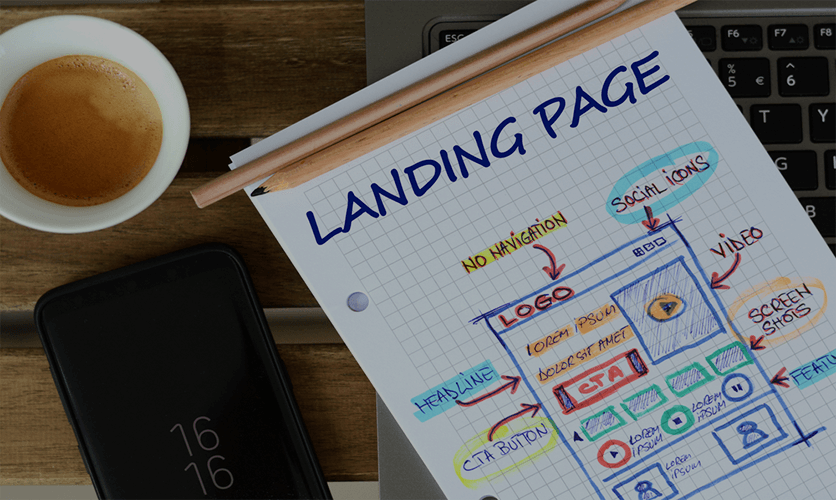
The purpose of the landing page
What do you want your landing page’s outcome? What do you want to achieve with it? Are you attempting to get viewers’ contact information, such as an email address? If you have a lot of objectives, try to prioritize them. Begin with the most critical objectives and work on the less important ones. Anyone who visits your landing page should be able to understand your goals and messaging clearly. Before building the landing page, make sure you have these aims in mind. It’s easy to get distracted by the page’s style and materiality, losing sight of your main ideas.Simplicity in Design
Visual simplicity and a minimalist design are vital since they serve to concentrate visitors and highlight the value offered. All domains of a landing page’s user interface are evaluated when selecting visual simplicity. Here are some visual simplicity characteristics: Visual simplicity preserves whitespace, which isolates calls to action (CTAs) from other components, allowing visitors to concentrate on them. The essential features and calls to action shine out due to the visual minimalism. Visual simplicity produces contrast by showing items in a manner that makes them stand out. The design flow is maintained by positioning items to encourage the user to continue reading.Logo
The logo is a distinctive emblem that distinguishes service providers. If people are familiar with and identify the symbol, it shows trust. Poor logos (poor quality, nonsensical, merely words without visuals) give the impression that the landing page is untrustworthy.Sub-Heading / Headline
‘Am I in the proper place?’ is users’ first and most essential inquiry. If the visitor arrives through the SERPs, the title they just clicked on should be on the page itself, giving the idea that they will discover what they are searching for. The headline and subline should always be relevant and concise, but they should also elicit emotional responses. Users can easily absorb information when messages are short and straightforward.Landing Page Flow and Direction
 The concept of direction suggests that landing pages should create with apparent signals (graphic or text) to move a visitor from the sales content to the CTA in the most smooth and distraction-free way possible. Your visitors will leave without examining your offer if you don’t give guiding indicators. Increased bounce rate land is a one-way ticket.